
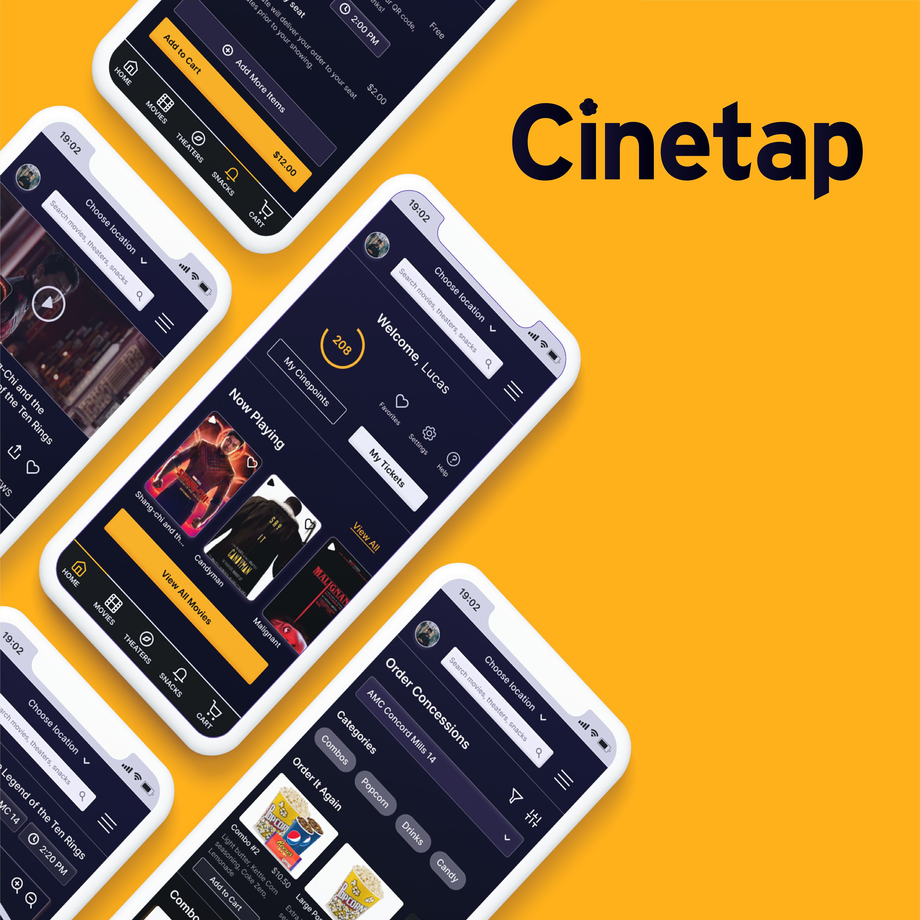
Overview
As part of Google's UX Design Certificate, I am working on a conceptual app to make it easier for people to order movie tickets and snacks while also earning rewards.
Many people use apps to order tickets, but still end up having to wait in line at the concession stand. With COVID-19, more people are looking for ways to order online as much as possible. This app solves this problem by being a one-stop-shop for a streamlined, accessible, and modern theater experience for everyone.
My Role
UX Research, UX Design, UI Design
Duration
Sept 2021 - Present
User Research
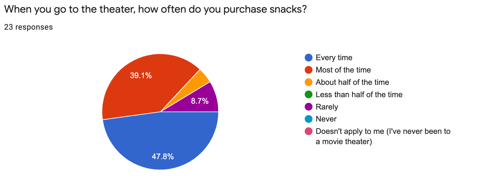
I found from the sruvey that most users purchase snacks every time or most of the time, so this is a critical part of the moviegoing experience.

I used the screener survey to get a general idea for how users currently feel about the process of ordering snacks.
Target Audience
I defined the target audience as people aged 18-42 who live in a suburban or urban area, go to the movie theater at least a few times a year, and have used apps to order food before. In the spirit of accessible design, I aimed to recruit a diverse representative group with people from various backgrounds.
User Survey
I began with a short screener survey to identify users to interview. I received 23 responses. Of those responses, 13 mentioned "long lines" as a reason for their rating. Other pain points mentioned were expensive prices, miscommunication, and feeling rushed.
User Interviews
I then selected five survey respondents to participate in a brief interview to learn more about their thoughts, feelings, and behaviors around going to the theater and identify pain points. I heard from users things like...
“I always have to plan to get to the theater early, which can be annoying. Sometimes the line is really long, and I miss part of the movie or the trailers. I don’t like having to be rushed.”
"I don't like that social pressure of the person behind me wanting me to hurry up and order. I want to make a well-informed choice of what I actually want rather than just be pushed to choose whatever there is."
"I would like to be able to order my tickets and my snacks all at the same time through an app. That would save me a lot of time and stress."
Major Pain Points Identified
1. Long lines
2. Too expensive
3. Miscommunication
4. Feeling rushed
Empathizing with Users
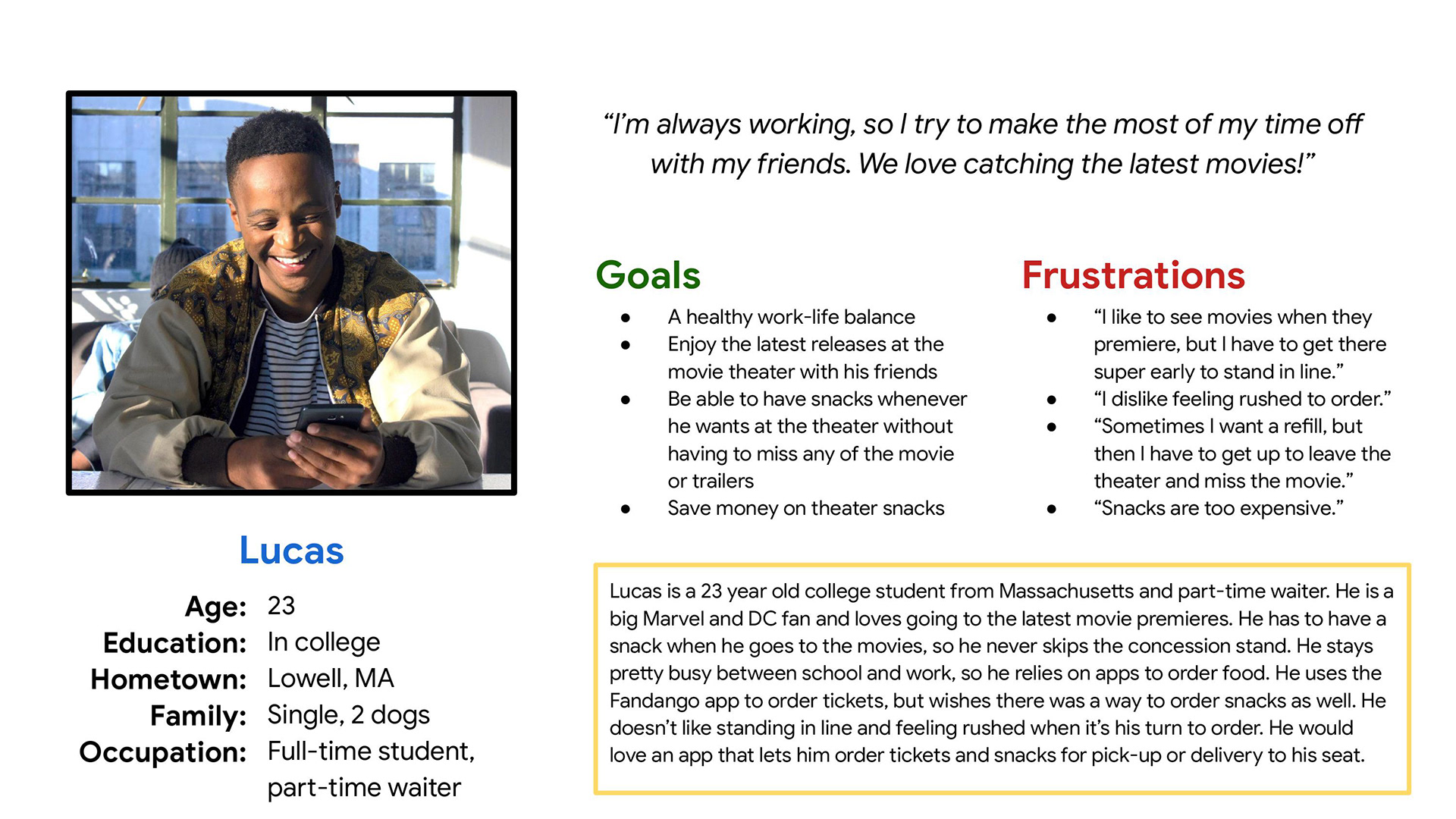
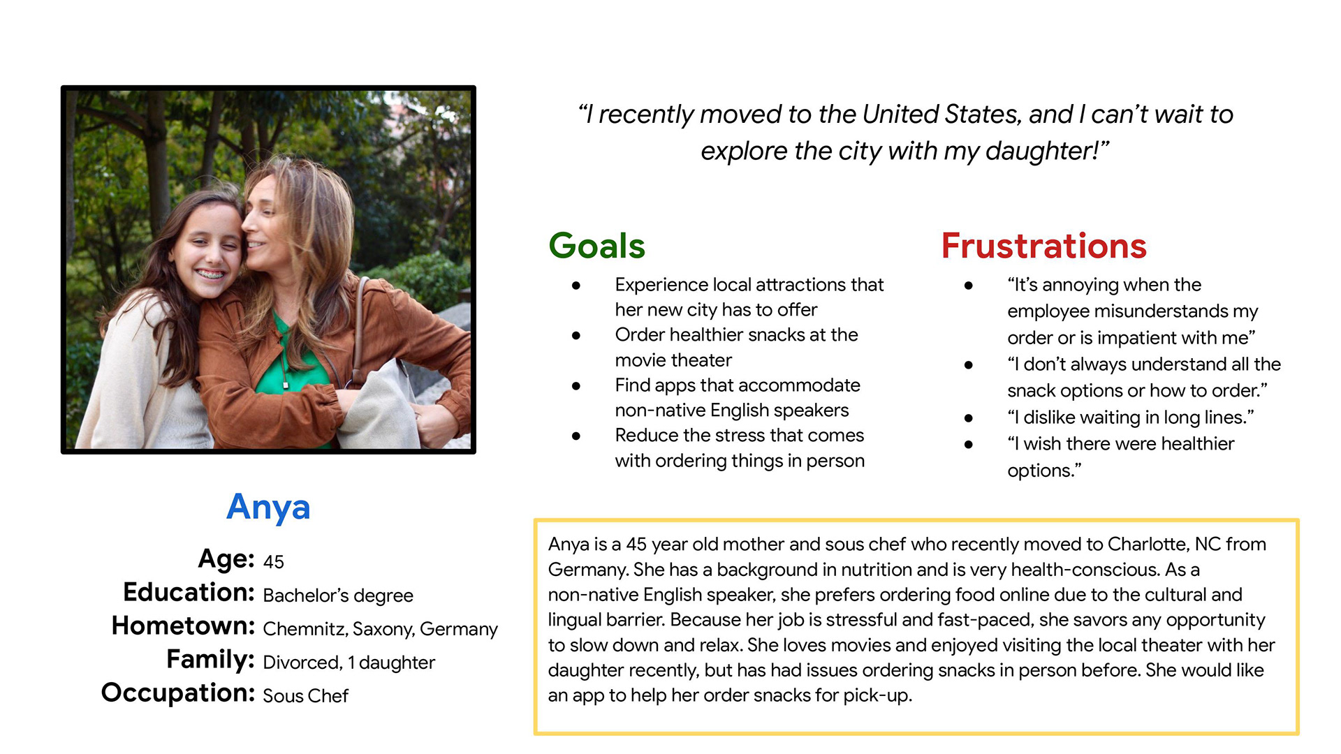
User Personas: Lucas & Anya
From my user interviews, I created two user personas: Lucas & Anya. Lucas is a 23 year old college student who works part time and enjoys going to the theater with his friends, especially for movie premieres. However, he's looking for any way to save money and would be interested in an app to make going to the theater easier. Anya is a recent immigrant who struggles with ordering in person, but wants to visit the local theater with her daughter. An app would make it easier for her to place orders ahead of time so she can focus on enjoying the movie experience.
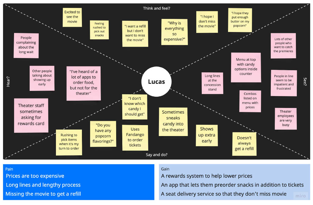
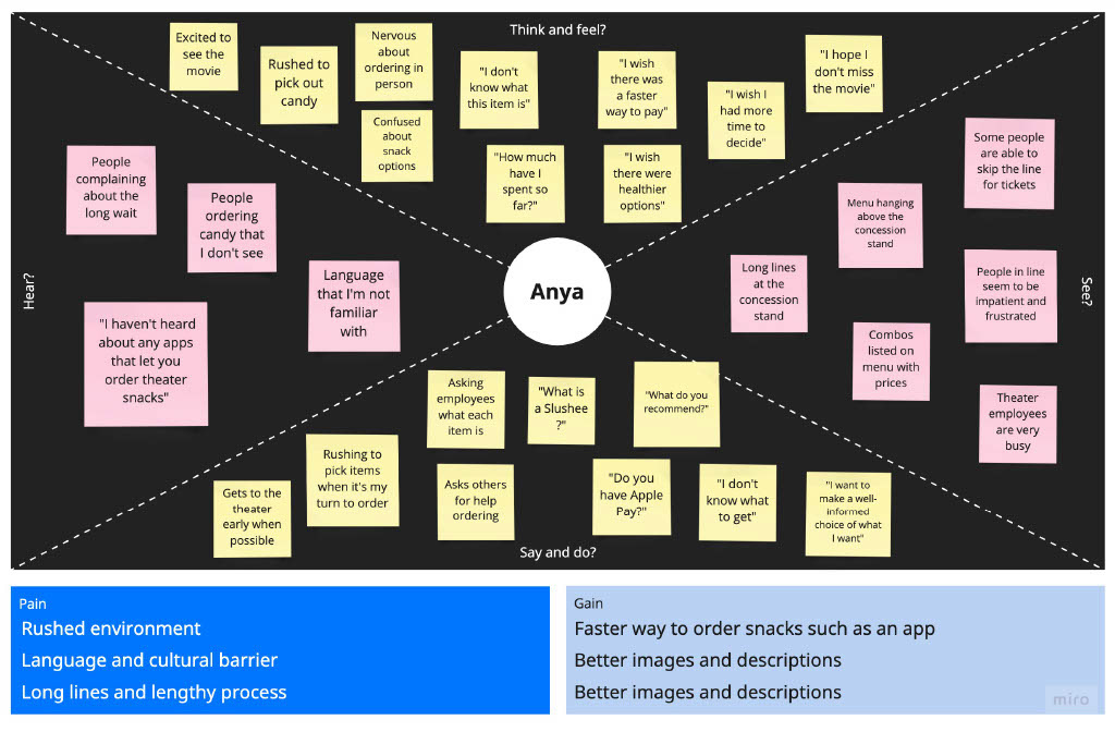
Empathy Maps
Using Miro, I created empathy maps for each persona, focusing on the full range of the user experience when ordering concessions in person, identifying pain points and opportunities.
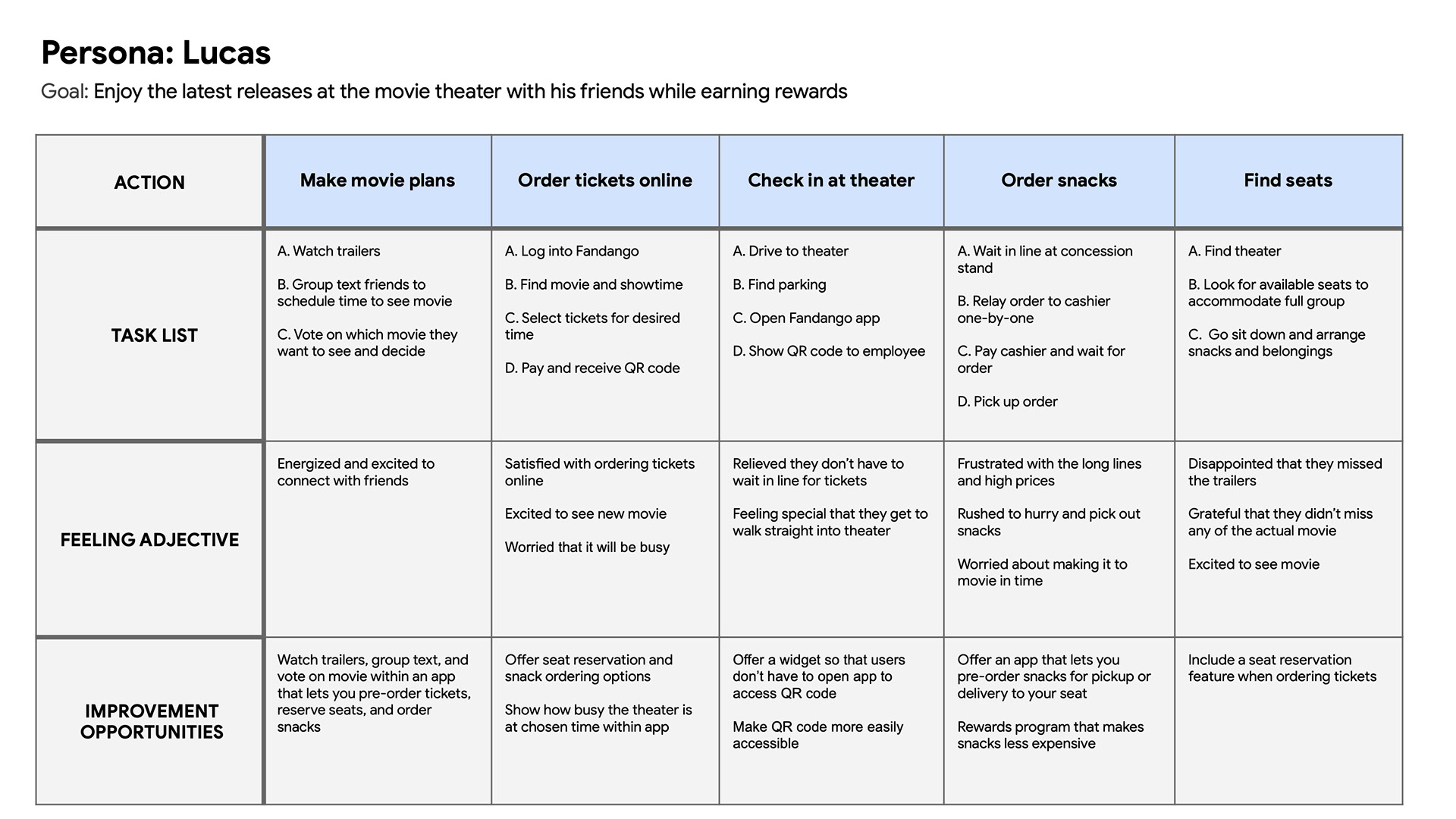
User Journey Maps & Problem Statement
I then created user journey maps for each persona and developed problem statements for each.
Lucas is a busy young professional and movie lover who needs an app that lets him order snacks in advance in exchange for rewards because he feels frustrated at the long lines, high prices, and he needs to save money.
Anya is a recent immigrant and non-native English speaker who needs an app that lets her easily order tickets and snacks online because she has difficulties ordering in person.
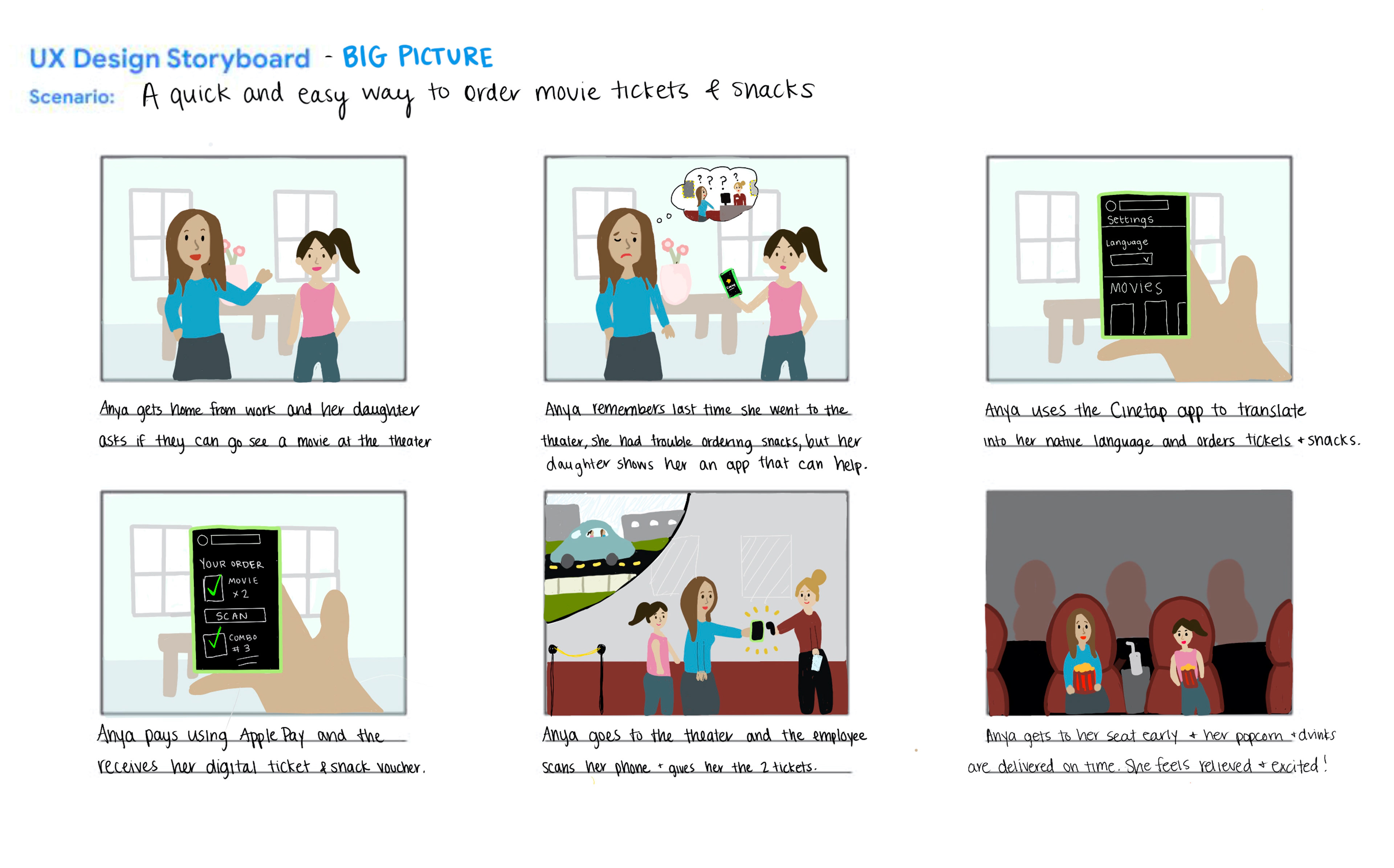
Storyboards
To further empathize with the user, I sketched both big picture and close-up storyboards for one of my personas, Anya. The big picture storyboard focuses on the overall user experience (seen to the right), while the close-up storyboard focuses on the specific actions the user takes inside the app.
Defining a New Direction
At first, I thought I would be designing a snack ordering app for movie-goers. But after my user research and interviews, I learned that most users would prefer to order tickets and snacks all within the same app. They do not feel that a snack ordering app on its own would be useful. So I expanded the scope of the project to be an all-in-one ticket and snack ordering app that caters to the entire moviegoing experience.
Product Characteristics
To make this product easy accessible, I decided to design an app that has the following characteristics:
1. Accessible
2. Easy to Use
3. Transparent
4. Rewarding
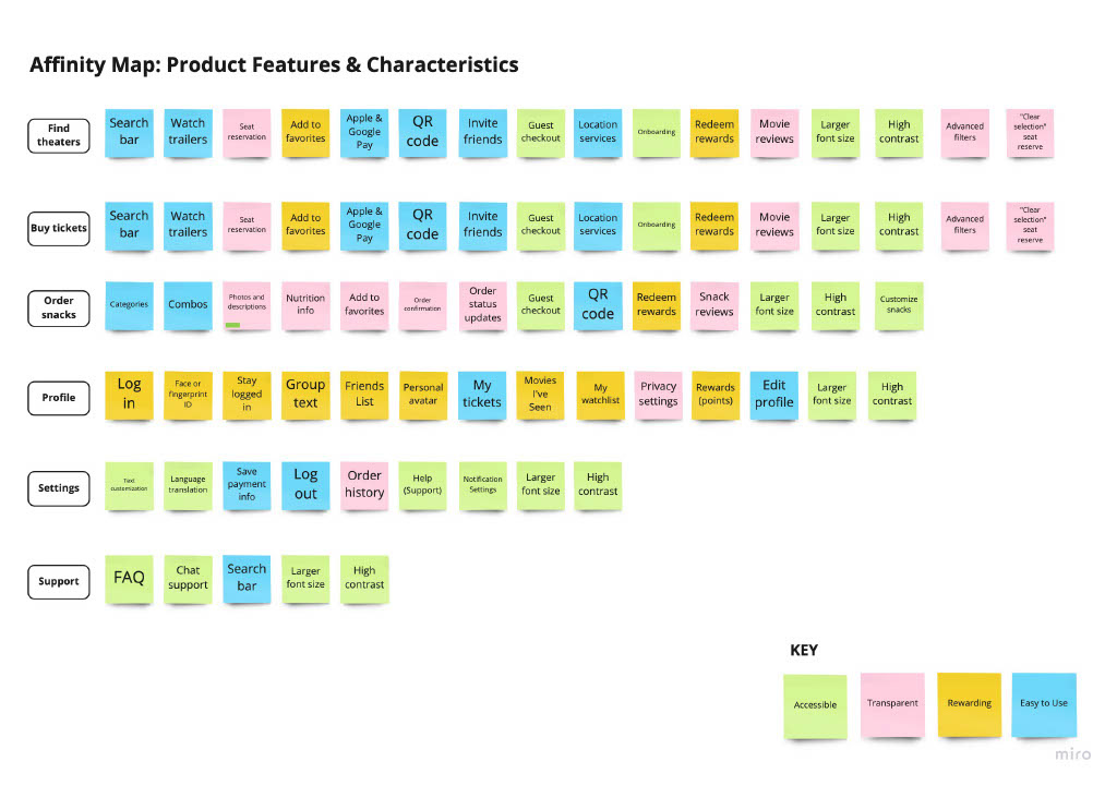
Feature Affinity Map
I then brainstormed a list of features and arranged them in an affinity map based on how they would fit into these characteristics (seen on the right).
Assessing the Competition
Competitive Analysis: Process
My next step was to conduct a thorough analysis of both direct and indirect competitors.
The direct competitors I chose were Atom, Cinemark, and AMC, with the indirect competitors being Fandango (movie ticketing app) and Doordash (snack ordering app). I analyzed reviews on the App Store and Google Play store and tested the apps myself to get a feel for what options users have currently.
For each product, I analyzed and documented the: desktop experience, mobile experience, accessibility, user flow, navigation, features, navigation, tone of voice, brand identity, descriptiveness, positive reviews, and negative reviews. From this analysis, I identified several gaps and opportunities.
Findings
* None of the movie theater apps currently offer snack customization.
* Users are frustrated and confused during seat reservation and feel that this could be improved with options to zoom, a clear seat legend, and options to change the details without going back.
* Only Atom has movie reviews in the app, and spoilers are not tagged or hidden.
* There is a lack of accessibility features. While the AMC website mentions assistive technology, it's not clear which theaters offer this and there is no way for the user to indicate this ahead of time with the app. There is also no option for language translation within the app.
* Help sections are not always easy to find. And if the user is able to find the help or support section, customer service tends to be lacking. They may be directed to the website's FAQ or given a number to call. Users don't appreciate having to call support and be placed on hold.
* There is a lack of social features and integration with existing social media, although going to the movies is a social experience for many.
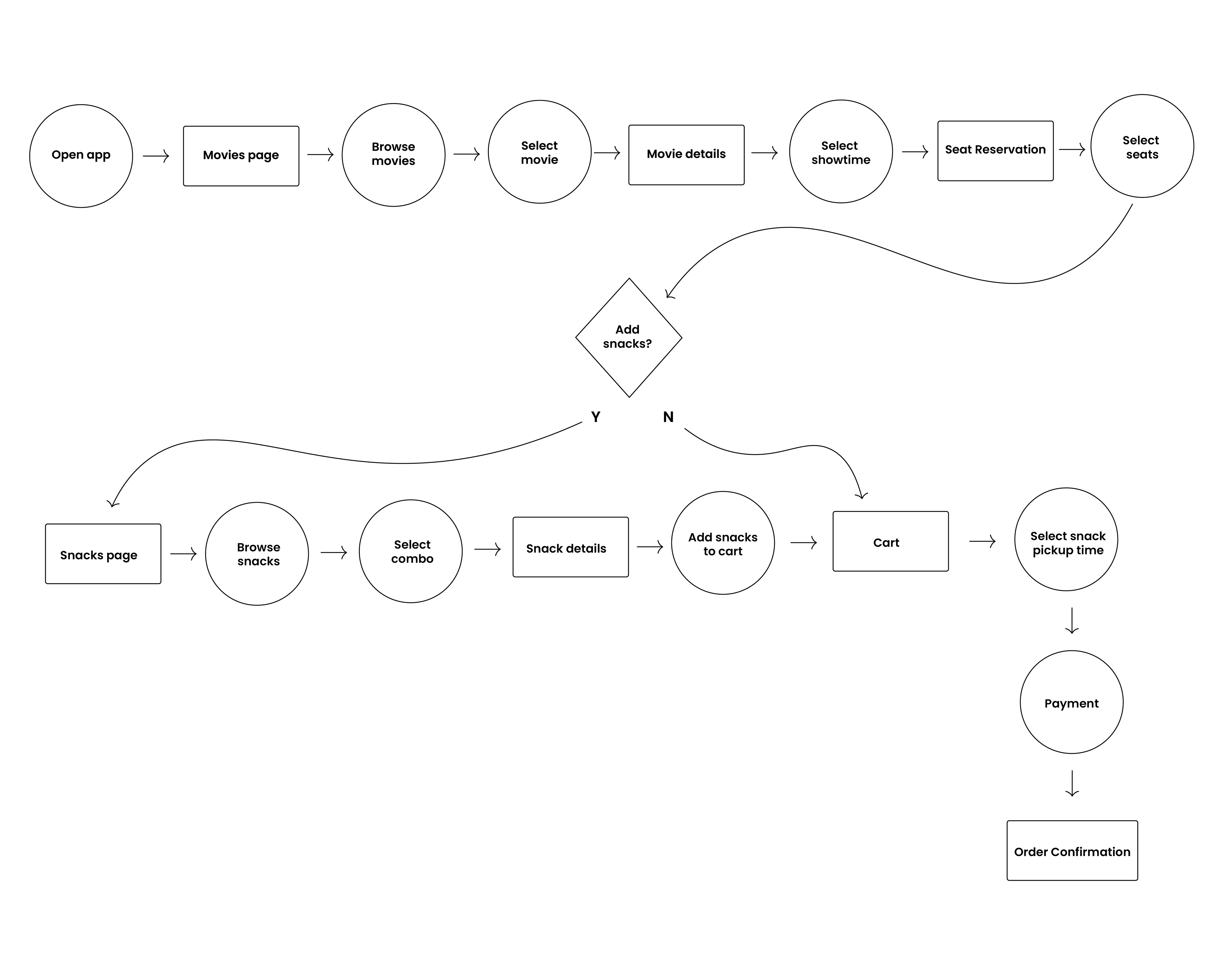
A Dynamic User Flow
Sample User Flow
I created a sample user flow for the task of ordering movie tickets and snacks. In this scenario, the user does not yet know which movie they want to see, so they want to search by movie. The user goes to the Movies page, browses and selects a movie leading them to the Movie Details page.
From there, they can select a showtime and are led to the seat reservation page. Once they select their seat, they have the option to add snacks. Once they have selected their snacks, they go to the Cart page, confirm their details, pay, and then finally land on the confirmation page.
Wireframes
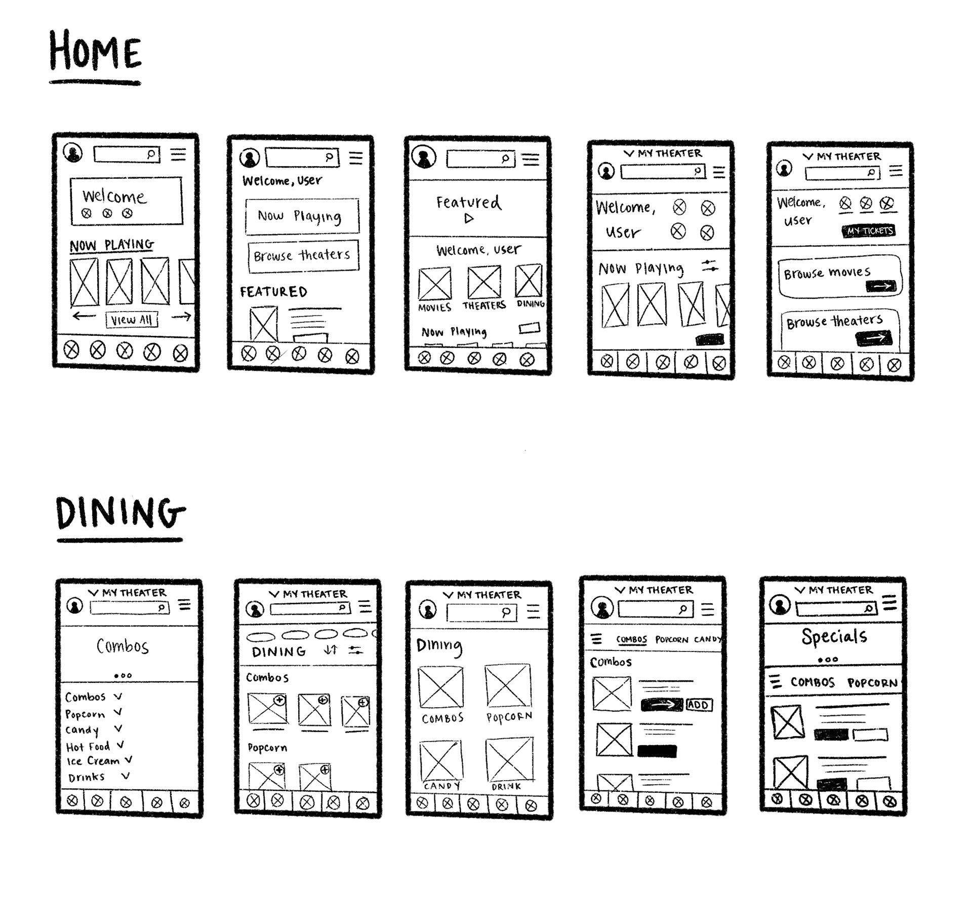
Sketching Paper Wireframes
Using Procreate, I sketched out five versions of the homepage and dining page to explore various options for how to organize the information. I made notes on each screen of what I thought worked best, and incorporated those ideas into the digital low fidelity wireframes.
Transitioning to Digital Wireframes
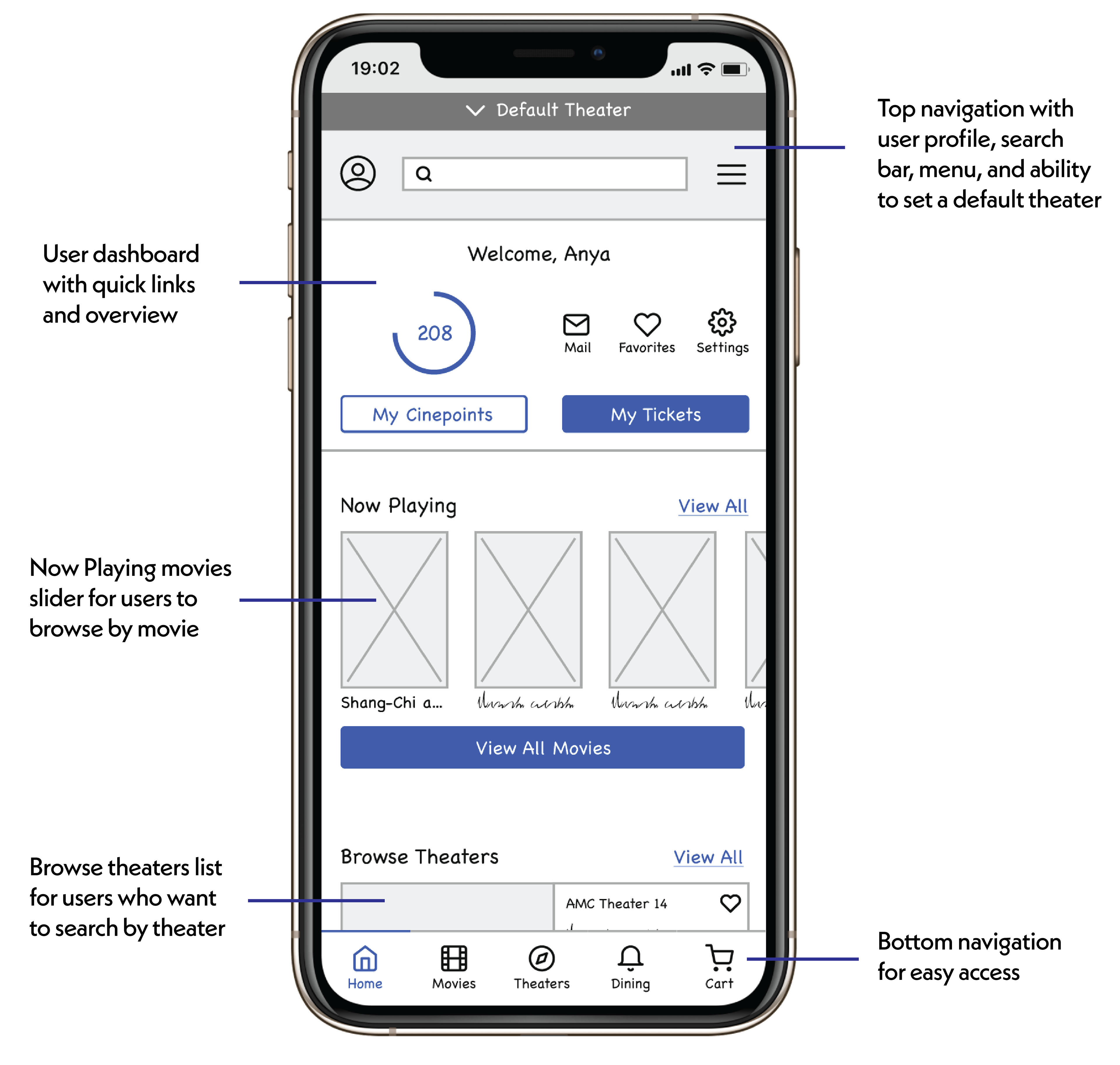
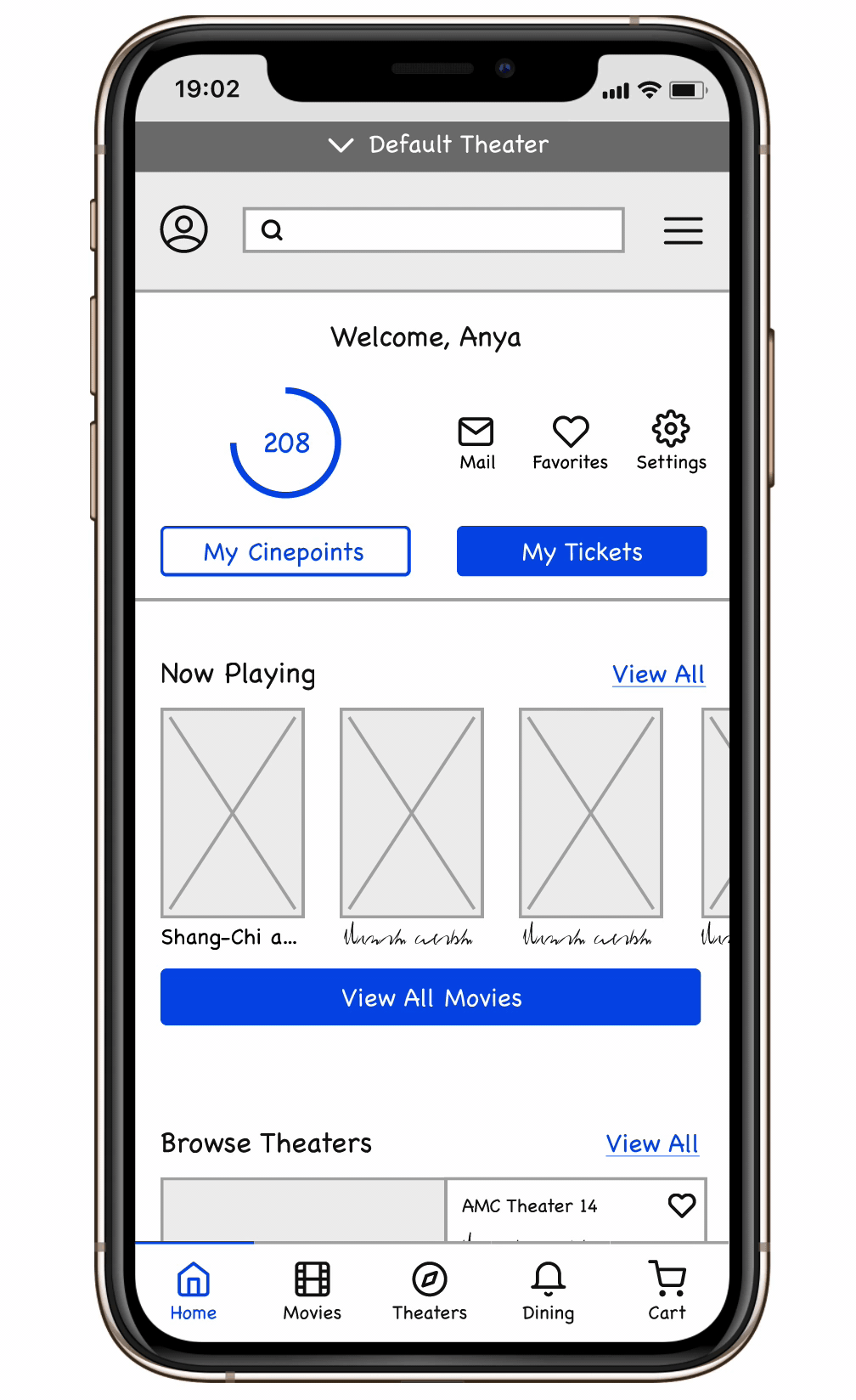
Next, I moved to Figma to create digital wireframes for all of the screens. Using a basic design system, I was able to create low fidelity wireframes that were still clean and organized.
The homepage serves as a central hub where users can access a quick dashboard. The top navigation gives users options to set a default theater, access their profile, use the search bar, and access the menu. The bottom navigation includes tabs to each of the main pages of the app. As users scroll down the homepage, they are given options to browse by movie, browse by theater, or browse dining options.
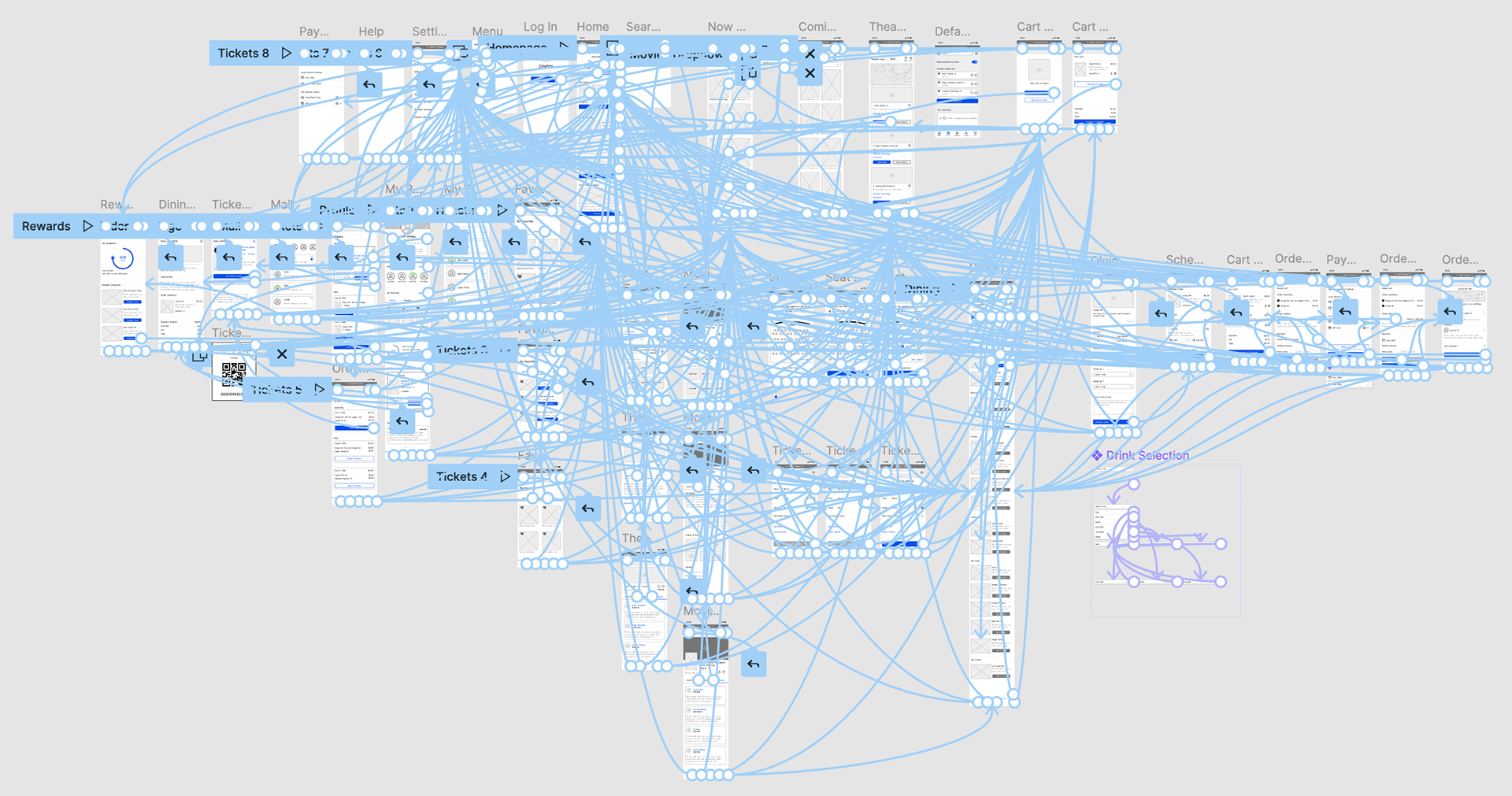
Low Fidelity Prototype
After creating all of the digital wireframes, I added interactivity through interactive components and states. The image below shows all of the connections between each of the wireframes.
Usability Studies
Process
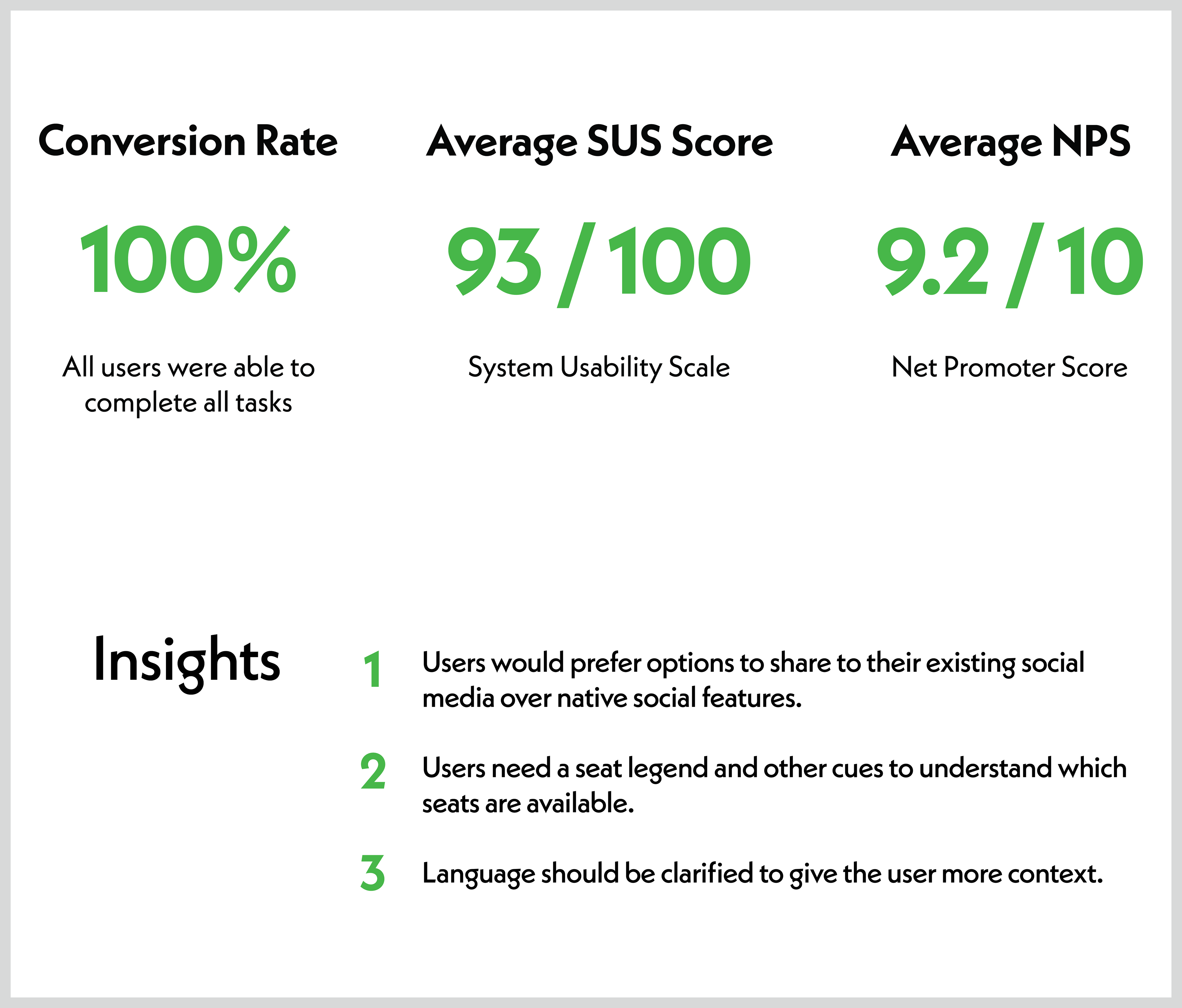
I then conducted five moderated usability tests remotely and had participants complete a set of tasks while answering follow-up questions. They then completed a brief usability survey to gather the SUS and NPS scores. I took notes in a spreadsheet and then transferred these over to digital post-it notes using Miro.
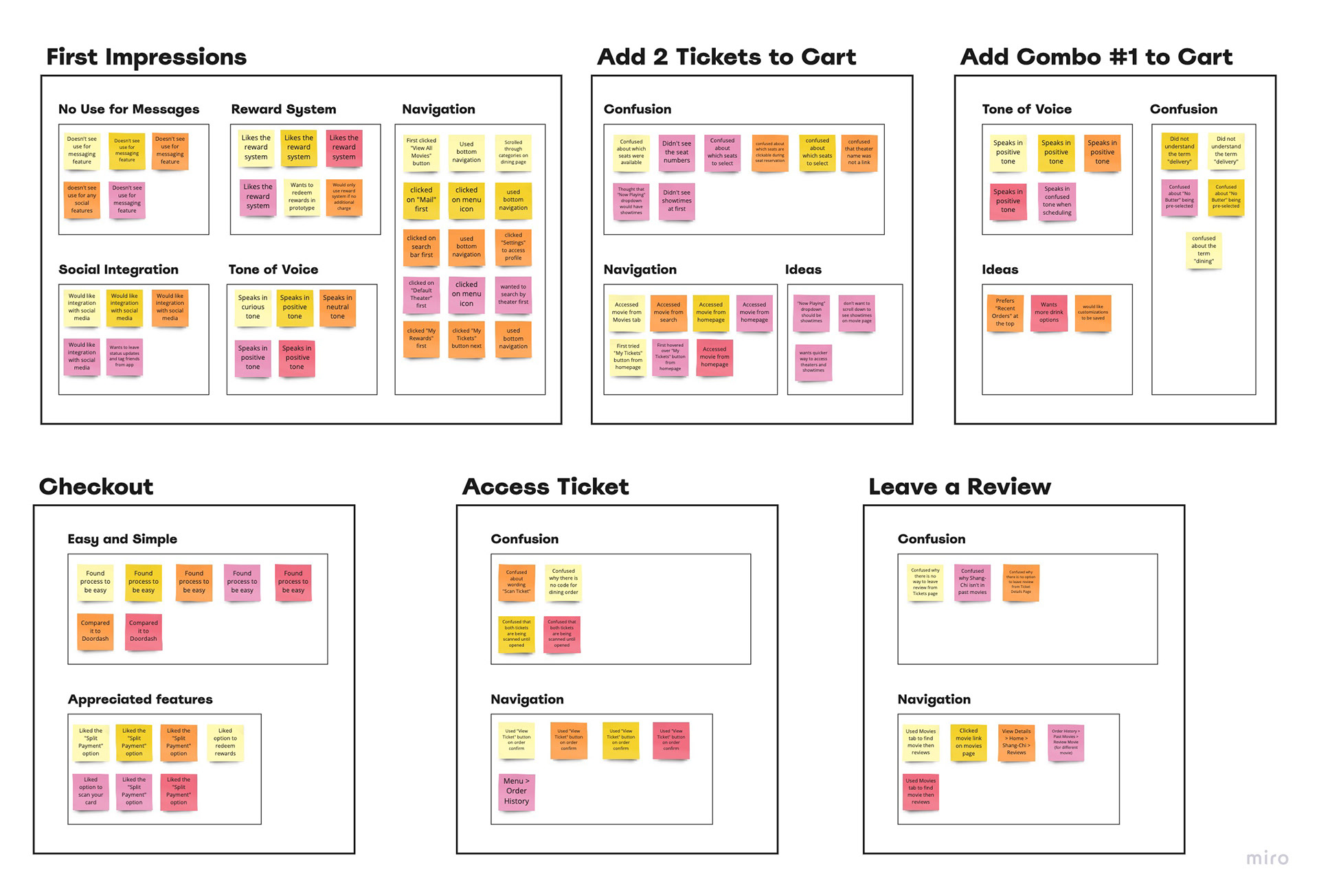
Affinity Diagram
I organized the observations and feedback from the usability study into groups based on each task, and then subgroups within those tasks that fit a common pattern to form an affinity diagram. This was used to help me identify patterns, themes, and insights.
From Patterns to Themes
5 out of 5 participants were confused about the need for a messaging feature. This means that most users do not see a need for messaging within the app.
4 out of 5 participants did not know where to click during the seat selection. This means that for most users, it's not immediately clear how to select their seats.
3 out of 5 participants wanted to leave a review, report problems, or make changes from the tickets page. This means that most users would prefer to have more options on the tickets page.
3 out of 5 participants were confused about the word “delivery” when scheduling their order. This means that most users do not inherently understand that "delivery" means delivery to their theater seat.
4 out of 5 participants were excited about the points and rewards feature. This means that most users see a clear benefit to a rewards system and would use this feature.
5 out of 5 participants found the checkout process to be easy and enjoyable. This means that all users are happy with the current checkout process.
High Fidelity Prototype
In Progress
I am currently in working on developing the high fidelity mockups and prototype.
Click the link below to see the current progress, and stay tuned for updates!